Like the new upgrade...

Handruin

Administrator
Joined
Jan 13, 2002
Messages
13,931
Location
USA
but any chance of some different skin/style choices?

A dark theme like one of these would be nice?

(In order preference)...

http://www.completevb.com/product/44

http://www.completevb.com/product/45

http://www.completevb.com/product/19


Thanks Chewy. I'll look into adding the new forum styles shortly. I'm still working out some kinks related to our anti-spam mod. It's keeping people from posting. I think you snuck in a post while I disabled it which helped me figure it out. :)
 

Handruin

Administrator
Joined
Jan 13, 2002
Messages
13,931
Location
USA

CougTek

Hairy Aussie
Joined
Jan 21, 2002
Messages
8,729
Location
Québec, Québec
Good grief... You've even got to pay for the themes? :tdown:
I share the dude's feeling about this. Paying for a theme sounds as good as an investment as paying for a ring tone. If someone truely wants a paid-for theme, then why not just buy it (or send the money to Doug so he can do it), but my advice would be to create one to your own taste if nothing free pleases you.
 

Handruin

Administrator
Joined
Jan 13, 2002
Messages
13,931
Location
USA
I share the dude's feeling about this. Paying for a theme sounds as good as an investment as paying for a ring tone. If someone truely wants a paid-for theme, then why not just buy it (or send the money to Doug so he can do it), but my advice would be to create one to your own taste if nothing free pleases you.

Here's the thing. It's $34 for that theme. I don't believe I could recreate it in less than a couple hours time so it would t really be worth me building my own (which is completely valid to do) when I can buy the use of a well-made style that someone has spent a few hours developing.

If anyone wants to create one, I will be happy to add it to the forum. The same is true for buying one and applying it to the forum.

I may also spend some time creating us a style and color scheme to make this site unique. The style may not be perfect for everyone which is why it's nice to be able to add on a style that others enjoy. All the existing styles we had were no longer compliant for this version which is why we don't have them any longer.
 

Howell

Storage? I am Storage!
Joined
Feb 24, 2003
Messages
4,740
Location
Chattanooga, TN
While I have found the show new posts button, I am not able to find a mark all posts read button under the mobile theme. Please?
 

Mercutio

Fatwah on Western Digital
Joined
Jan 17, 2002
Messages
22,297
Location
I am omnipresent
I like the new mobile site quite a lot. I'm not completely enamored with the default theme though. I'm not really sure why, but perhaps it's that there's relatively little contrast screen elements. I'm sure it's something I'll get used to and I know full well that it can be a total PITA to modify skin-able elements on a template based site, but right now I do wish there were another choice or two.
 

Handruin

Administrator
Joined
Jan 13, 2002
Messages
13,931
Location
USA
Thanks for the feedback. I've also noticed a lack of contrast in the mobile theme. The icons which indicated new threads in a forum seems to be only a few shades different from a forum that has no new threads. That's just one example of several, but I see the same thing. Still, I like browsing our forum with the default style much more than with the previous one. I'll see what options are available for us. It looks like several of us want different theme options.

I've been getting no feedback to the issues I've seen with the spam plugin tool. I'm still trying to figure out how to get this working but it may take some time. I'll need to setup a copy of this forum to play around with the issues so that I don't stop activity here. As you've probably seen, there has been more spam activity making it through than normal and this is the reason why.
 

sechs

Storage? I am Storage!
Joined
Feb 1, 2003
Messages
4,709
Location
Left Coast
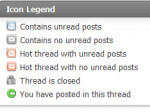
I have trouble with the icons. Particularly, the envelope icons are difficult to differentiate.
 

sechs

Storage? I am Storage!
Joined
Feb 1, 2003
Messages
4,709
Location
Left Coast
I don't seem to have a legend at the bottom of my pages, but, anyhow, the issue is that the read and unread icons are the same color and have few differentiating features.
 

Handruin

Administrator
Joined
Jan 13, 2002
Messages
13,931
Location
USA
There should be a blue icon with downward arrows with a title labeled "Go to first new post" next to the label. Clicking this will take you to the first unread post.
jump_to_new_post.png
 

ddrueding

Fixture
Joined
Feb 4, 2002
Messages
19,742
Location
Horsens, Denmark
I'll add an item to my list to improve the default icons.

Might I propose:

Contains unread posts: Blue open envelope
Contains no unread posts: Grey closed envelope
Locked: Padlock
You have posted in this thread: Green arrow

I don't think we have a need for anything else.
 

Handruin

Administrator
Joined
Jan 13, 2002
Messages
13,931
Location
USA
Might I propose:

Contains unread posts: Blue open envelope
Contains no unread posts: Grey closed envelope
Locked: Padlock
You have posted in this thread: Green arrow

I don't think we have a need for anything else.

That would be easy-enough to do now. I would just remove the red version of the icon which is used to indicate a "hot" thread. I doubt anyone cares about that here, but I could be wrong. I still think it might be more helpful if there was more contrast between the open envelope and the closed envelope. I could put a dash of red in the open envelope to catch the eye.
 

ddrueding

Fixture
Joined
Feb 4, 2002
Messages
19,742
Location
Horsens, Denmark
That would be easy-enough to do now. I would just remove the red version of the icon which is used to indicate a "hot" thread. I doubt anyone cares about that here, but I could be wrong. I still think it might be more helpful if there was more contrast between the open envelope and the closed envelope. I could put a dash of red in the open envelope to catch the eye.

Fine with me, or just up the saturation of the blue a little. The grey will blend pretty well with the existing background already.
 

Handruin

Administrator
Joined
Jan 13, 2002
Messages
13,931
Location
USA
Fine with me, or just up the saturation of the blue a little. The grey will blend pretty well with the existing background already.

ok, so I spent a little bit of time and revised the icons and added a more contrast. I changed the "hot" thread from red to a deeper blue. Most importantly, I've tried to add a "plus" symbol on top of the thread icon that has the unread envelop to hopefully make it even more clear that there is unread messages.

Below is the pallet of new icons I created. Let me know what you think (you won't hurt my feelings) and I'll revise as-needed.
 

Attachments

  • forum_new-48.png
    forum_new-48.png
    3.2 KB · Views: 42
  • forum_old-48.png
    forum_old-48.png
    2.6 KB · Views: 42
  • thread_deleted_30-right.png
    thread_deleted_30-right.png
    2.9 KB · Views: 42
  • thread_dot_hot_lock_new-30-right.png
    thread_dot_hot_lock_new-30-right.png
    4.1 KB · Views: 42
  • thread_dot_hot_lock-30-right.png
    thread_dot_hot_lock-30-right.png
    4 KB · Views: 42
  • thread_dot_hot_new-30-right.png
    thread_dot_hot_new-30-right.png
    3.5 KB · Views: 42
  • thread_dot_hot-30-right.png
    thread_dot_hot-30-right.png
    3.1 KB · Views: 42
  • thread_dot_lock_new-30-right.png
    thread_dot_lock_new-30-right.png
    4.1 KB · Views: 42
  • thread_dot_lock-30-right.png
    thread_dot_lock-30-right.png
    3.5 KB · Views: 43
  • thread_dot_new-30-right.png
    thread_dot_new-30-right.png
    3.5 KB · Views: 42
  • thread_dot-30-right.png
    thread_dot-30-right.png
    2.9 KB · Views: 42
  • thread_hot_lock_new-30.png
    thread_hot_lock_new-30.png
    3.9 KB · Views: 41
  • thread_hot_new-30.png
    thread_hot_new-30.png
    3.2 KB · Views: 41
  • thread_hot-30.png
    thread_hot-30.png
    2.8 KB · Views: 41
  • thread_hot_lock-30.png
    thread_hot_lock-30.png
    3.7 KB · Views: 41
  • thread_lock_new-30.png
    thread_lock_new-30.png
    3.8 KB · Views: 41
  • thread_lock-30.png
    thread_lock-30.png
    3.1 KB · Views: 41
  • thread_moved_new-30.png
    thread_moved_new-30.png
    4.1 KB · Views: 41
  • thread_moved-30.png
    thread_moved-30.png
    3.6 KB · Views: 41
  • thread_new-30.png
    thread_new-30.png
    3.2 KB · Views: 40
  • thread_old-30.png
    thread_old-30.png
    2.6 KB · Views: 40

Handruin

Administrator
Joined
Jan 13, 2002
Messages
13,931
Location
USA
I should add, if anyone wants to take a stab at adjusting the icons, there is a graphics dev kit for the forum. PM me and I can send it to you.
 

ddrueding

Fixture
Joined
Feb 4, 2002
Messages
19,742
Location
Horsens, Denmark
You missed the main concept I was after, but that makes me think that the way I browse the forum is different than other might. Let me spell out my method:

1. On the main page, see if there are any new posts in a forum. The easiest way to check this is if the icon stands out from the background (blue) or doesn't (grey).
2. If there are new posts in a forum, go there and see how many there are. The easiest way to check this is if the icon stands out from the background (blue) or doesn't (grey).
3. Jump to the unread posts of a thread by using the little "Go to new posts" button (green maybe?)

The most important property of a thread is whether there is new content in it or not.
By making threads without new posts the same main color as threads without, you are eliminating the color as a useful indicator of the main thing that matters (new posts or no).
Threads without any new content may as well blend in with the background.

I may be way off base, and feel free to correct me if that is the case.
 

BingBangBop

Storage is cool
Joined
Nov 15, 2009
Messages
667
Sorry, but I just recursively use the new posts button at the top left of every page, then click the blue arrow to get to the new content. Therefore I can totally ignore the icons.
 

Newtun

Storage is nice, especially if it doesn't rotate
Joined
Nov 21, 2002
Messages
492
Location
Virginia
I agree with ddrueding; high contrast for forums/threads with new posts, low contrast for those without.
Seconded, IMHO. I like the new icon-ing. "Hottness" is of secondary interest. (Also, my personal preference as a "minor-leaguer" here is for smaller icons.)

But overall, a very nice upgrade! And per Bing's suggestion, the "New Post" button is very handy, and may also become my default. The trade-off is non-obvious-ity of which sub-forum the post is from.
 

Handruin

Administrator
Joined
Jan 13, 2002
Messages
13,931
Location
USA
You missed the main concept I was after, but that makes me think that the way I browse the forum is different than other might. Let me spell out my method:

1. On the main page, see if there are any new posts in a forum. The easiest way to check this is if the icon stands out from the background (blue) or doesn't (grey).

I thought I achieved this at least at then highest level with the contrast between gray and blue icons?
forum_old-48.png vs forum_new-48.png

2. If there are new posts in a forum, go there and see how many there are. The easiest way to check this is if the icon stands out from the background (blue) or doesn't (grey).
OK, so it looks like the problem is that the "hot" threaded icon still shows up blue even when there are no new posts which makes the usability less clear.

thread_old-30.png
thread_hot-30.png This one should be gray
thread_dot_hot-30-right.png This one should be gray

These should be the primary indicator of new messages and I can likely remove the "+" icon since color would be the defining indicator.
thread_hot_new-30.png New message(s) in hot thread
thread_dot_hot_new-30-right.png New message(s) in hot thread that you have replied in previously
thread_dot_new-30-right.png New message(s) in normal thread that you have replied in previously


3. Jump to the unread posts of a thread by using the little "Go to new posts" button (green maybe?)

The most important property of a thread is whether there is new content in it or not.
By making threads without new posts the same main color as threads without, you are eliminating the color as a useful indicator of the main thing that matters (new posts or no).
Threads without any new content may as well blend in with the background.

I may be way off base, and feel free to correct me if that is the case.
You're not off at all. I just need to understand better so I can make the right changes. Thanks for the feedback.
 

Handruin

Administrator
Joined
Jan 13, 2002
Messages
13,931
Location
USA
Sorry, but I just recursively use the new posts button at the top left of every page, then click the blue arrow to get to the new content. Therefore I can totally ignore the icons.

Will the icon changes proposed affect your typical use case of the forum? I'm assuming not since you ignore them anyway, but wanted to get clarification.
 

BingBangBop

Storage is cool
Joined
Nov 15, 2009
Messages
667
Will the icon changes proposed affect your typical use case of the forum? I'm assuming not since you ignore them anyway, but wanted to get clarification.
Correct, whatever change you make won't affect me at all, since I pay no attention to them.

I made my statement on the theory that maybe others could use my method too and thereby eliminate any issues they have with the icons. To me, since I'm going to read all the new posts anyway, it makes no sense having to search through the icons for new content. It just seems more efficient.
 

sdbardwick

Storage is cool
Joined
Mar 12, 2004
Messages
609
Location
North San Diego County
I wasn't clear (not unusual). I like low contrast between the background color and icons for fora without new posts. My ideal setup would be essentially transparent icons for items without new content, with any solid color indicating new posts. The color of the icons is not relevant to me (don't want to decode meanings - lazy), just want a highly differentiated binary no new posts/new posts indicator.


Non-sequitur:
Is there a way to disable/hide the quick reply box? I didn't see a setting in the user CP. Just eats up display space and makes me scroll more (see - lazy).
 

ddrueding

Fixture
Joined
Feb 4, 2002
Messages
19,742
Location
Horsens, Denmark
I don't want to derail this thread, but can you post a screen capture or something of what you're seeing? I am able to easily see text that was highlighted blue and knew it was a linked referenced in the post. If you're seeing something different I'd like to be able to also see it so I can try to fix it. Feel free to post the example in the feedback section so I can leave this thread as-is.

Perhaps we can have hyperlinks underlined? Or again dial up the blue to make them more distinguishable? On my P-series Dell screens it isn't an issue, but I was just on a crappy Acer 22" and links practically disappeared.
 

Handruin

Administrator
Joined
Jan 13, 2002
Messages
13,931
Location
USA
I tried the underlining and I didn't care for it. It changes it for everything in the forum. If that's what it needs to be then so be it, but I was hoping to make the URL stand out better without it.

Is this contrast better? I've made the body text black (#000000) (it was a lesser black before) and now the font coloring is a brighter blue.

Example URL with color coding.
 

Handruin

Administrator
Joined
Jan 13, 2002
Messages
13,931
Location
USA
I should also note I changed the hover over color to a brighter red. If that doesn't work, maybe a different color would be better?
 
Top